Hit Counter

Website counter

Thursday, 31 March 2011

The HANGTEN Hoodie


The brief:

We are looking to create an interactive project, where you'll be teamed up and required to individualise your hangten hoodie. Each individual in the team will have to add their own artistic touch, be it illustration, words, badges or other items that show your individual taste.We want the hoodie to feel like its going on a journey. Its been a reliable item that will bring back a great time of moment in your life. 

The team : 

Kelvin Young & Saiesh Naidoo
Collaboration between saiesh naidoo and kelvin young

Saiesh naidoo 


Fine arty, hands on designer (uses mixed media)

Kelvin young
Simplified taste with illustraton art


Saiesh Naidoo                                                          Kelvin Young


Creating the contrast

Creating something different...

We were working on a design for the hoodie  that suited the theme . the freedom of doing whatever we felt like made it easy for us to generate ideas.

Idea 1, from sketch 1 the idea of just using our African culture (with a taste from each culture)we created  variety by generating the concept of using two different techniques.we decided and agrred on   using a technique on the hoodie that was traditional. Which was lino printing an old but effective contemporary form used in many designs today.
Lino prints
Sketches
Vectored drawings from photography and art works

to futher the contrast we decided to allocate kelvin with vector clean cut illustratons which would be drawn out from images of both our experiences. As we wanted to have a simple comic on the back of the hoodie.and for the front we wanted to do a lino which would include images that represented things surrounding africa.


 These were the illustrations Kelvin did.


These were the Lino that Saiesh did with Kelvin's Help


The Vector Comic Kelvin did


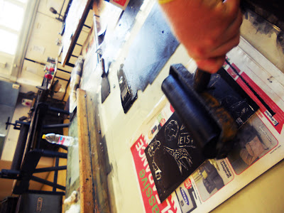
lino printing process

step 1
lino roller and ink

step 2. 
the ink for the lino

step 3.
roll out the ink onto the roller

step 4. 
roll on the ink thinly to the roller so it just bases the roller with one layer of ink evenly.

step 5. 
roll on the ink with the roller evenly covering the sheet of lino.

step 6.
we put the lino to dry in an oven bed.

step 7
when lino is dry, you engrave using different blades of choice,i chose to use an enty cutter blade.

step 8.
when lino is cut we then apply oil based paint with a roller over the cutting.

Step 9
We then get a clean sheet of paper and place it over the painted etching and we place it in a printing press to be pressed so the image can be transferred to the clean sheet of paper.


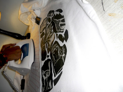
Printing on the Hoodie

This was a hard thought through process because there are many different ways to get a image onto fabric. one of the many methods was silk screening that we wanted to do by ourselves in the fine art section of our college, we sought help from one of the fine art lectures, after he explained to us the process we realized it would take too long as it is almost a 2 day process. So the method we went with was iron on transfers that would be the cheapest and most effective way to transfer the image across. 


Finished Hoodie


Back


Tuesday, 29 March 2011

IJUSI FONT: UMSHIMI WAMI

This is a project we were given by Mister Garth Walker (the founder of Orange Juice Design in 1994 and Mister Waker design studio in 2008) for his publication IJUSI.

The brief for this project was pretty simple, we had to design a non-functional font that is inspired from south Africa. The font had to be laid out for the publication in two separate A4 pages in which Mister Walker could choose if he wanted to use the whole spread.

For college we had to layout the font as a double page spread (DPS) showcasing the font and a brief description on the font.

My inspiration for this font spurred from South African Politics, the apartheid struggle song of the Africans and our President Jacob Zuma... "UMSHIMI WAMI" directly translated as "bring me my machine gun"

THIS IS NOT

In this project we were asked to make a one Minute movie describing what Anti-Design is. We were separated into a team of 5 people to execute this task.


What is Anti-Design: 
Anti-Design to me is a trend created to appose popular beliefs, and change a persons perspective on something. 


Concept: 
THIS IS NOT

The actual video that the team is going to make is going to be still images of popular ideas of a subject and saying that this is not that subject for example in art We will have an image of a painting say the Scream by Edvard Munch, which will have an phrase saying this is not Art. Then end the video with the line “this is not design… this is not a difficult concept.”

Purpose for the video

The whole purpose of this video is to take the idea of Anti-Design and strip it down to the cleanest form of its meaning, without it been sugar coated.

So for the means of simplicity we had to brainstorm things that are simple and give a clear idication that it is confusing yet understandable for elements that can be included in the video.

White noise or T.V. static
Test screen
Hand written fonts...

This is the completed Video...


Viral Campaign  Concept:

In this part of the project we had to work Individually to create our own Viral Campaign.

Viral is spreading an idea or concept cheaply effectively and in a interesting way.

Idea: The movie The Social Network.
Facebook started amongst students spreading from friend to friend or by word of mouth. So I figured everyone these days has access to the internet and email. So I figured my viral campaign can be sent via email to people, but my viral must be something that when the reader opens it, they want to find out more and forward the email to friends.

So I decided to make a series of controversial posters that are topics of many discussions in today’s society such as Self Mutilation, Substance abuse, pornography, social networking etc. with the catch phrase this is not (whatever the topic is) and then saying this is not a difficult concept with a link to the youtube video of our 1minute movie, very much like our video.


This will get people thinking when they see the poster “but hang on this is Self-Mutilation, how is this not a hard concept because it is!” this will make the person want to look further into the topic which will eventually have them clicking on the link and bringing them to our video.     


         Viral Posters


Facebook Page


YouTube Page 


DVD COVER